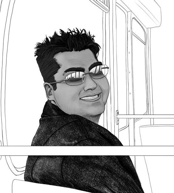
This is my second self-portrait for ArtistDojo.com's self-portrait challenge. The style of the challenge was basically as realistic as you can get it.
The jacket just didn't work out well... it was supposed to be leather, but looks like denim. So on the down side, I'll have to practice my leather, on the upside, I have an accidental denim technique. I basically did it with small scribbles stacked on top of each other.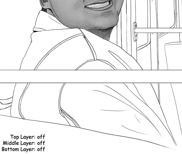
above: all layers turned off.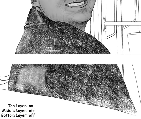
above: if you look to the bottom right, you can see my scribbly pattern. I also did some partial erasing for the shiny areas.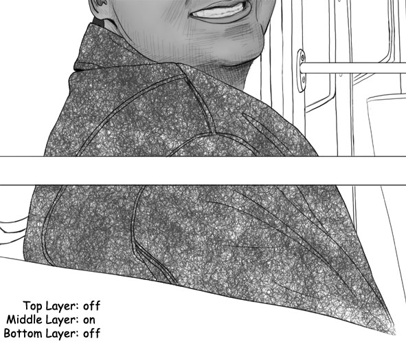
above: this is the second scribbly layer. I basically just duplicated the first scribble layer (before I made the shiny spots) and offset it... so you 'll see in the following image, since it's offset, it darkens in more of the texture.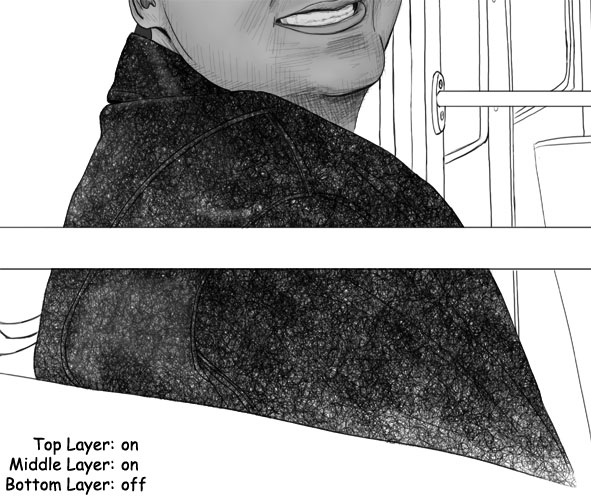
above: here are both of the scribbly layers on at the same time.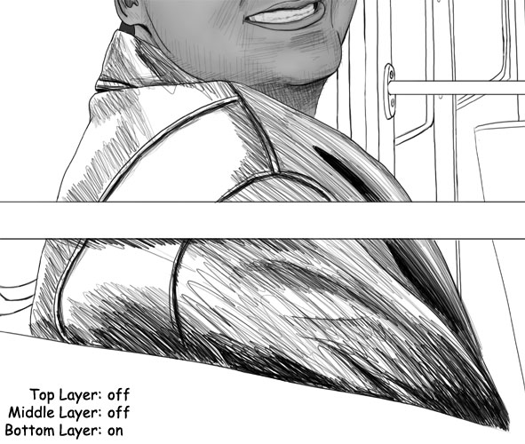
above: and finally, this is the layer under the scribbles that gives it all the shadows.
Thursday, January 31, 2008
Accidental Denim
Chinese Brush: Make A Bird with Split Brush
Edit History:
- (02/01/2008): Fixed bird's belly and added photos of split brush
Split Brush
I said be gentle on your brush when dabbing, and this is no exception. After you rinse the brush, hold it vertically with the tip facing down and touch it to your dabbing cloth. Put a little bit of pressure on the brush so the bristles bend a little, then twist the brush in between your fingers.
The tip will split into many smaller tips.
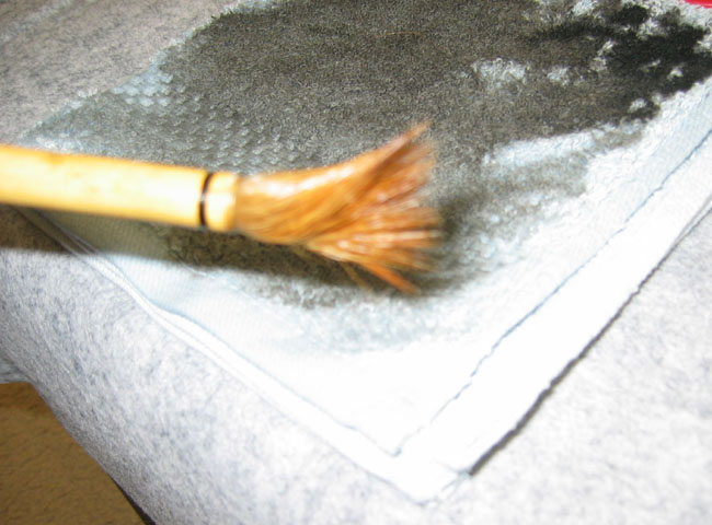
Touch the brush to the dabbing cloth horizontally to narrow the tip. You should end up with a cylindrical shape that's spiky on the tip.
Load the brush with ink like normal and go for it.
Make A Bird
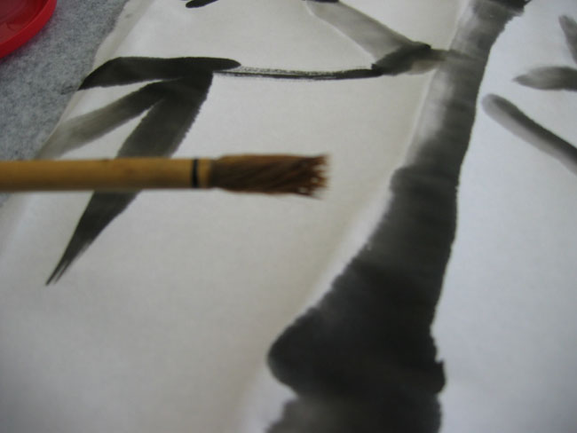
Step 1: use a detail brush to make the beak and the eye.
Step 2: use a hard bristle brush, using split brush technique, to make those nice scratchy strokes for the top of the bird's head and then the top of the body. Notice how we make another stroke in the middle of the body for a little definition in the wing.
Step 3: use a hard bristle brush, NO LONGER with the split brush tip, to add in a line for each wing-tip and then a couple lines for the tail.
Step 4: make a light gray stroke under the head and another under the body. Let them be a little wet, so it's fuzzy looking on the bird's underside.
Step 5: use a detail brush to make the legs and talons.
Step 6: make it up! These are the techniques I used for that specific bird in that specific pose, but now that you know the techniques, just go get some reference of some birds and have fun! Just remember, we made the beak and eye first so we could control where we ended up using or not using our wet on wet techniques.
Dirty Water
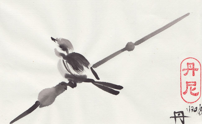
Take a really good look at the belly of my bird.
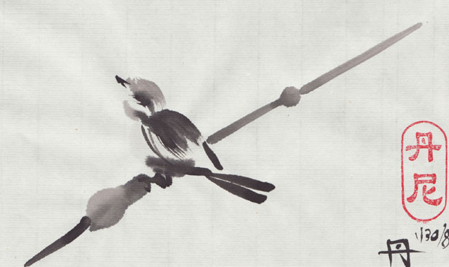
The original bird was a lot fatter and cuter. I thought I was being sly by using a brush directly from the dirty rinsing water because I wanted a very light gray belly. Well, when it dried, my strokes completely disappeared (because it was just water!)
Let me tell you, that fat little bird was sooo cute... until I got home. After the ink dried, the fat belly disappeared! And now my bird just has a big head! :)
Lesson: Dirty water is still water! It's NOT a substitute for your light gray pallet.
Edit: I fixed the bird last time I had the inks out:


 Labels:
ChineseBrush,
Technique
Labels:
ChineseBrush,
Technique
Chinese Brush: A New Brush
Edit History:
- (2/1/2008): be sure to checkout i-paint's comment about new brush caps.
We have our own brushes now and it leads to questions about how to care for a brush.
The Glue
First of all, new brushes have glue in the tip to make them look all perfectly straight and beautiful when you buy them. This can also be used to conceal the quality of the brush since it looks great in the store and my act different when you start using it and the glue comes out. So just be cautious about that. Expect glue, but try not to get ripped off.
Soak your new brushes in water for about 10 or 15 minutes to get the glue out or they may act a little strange when you use them. For Example, my hard bristle brush was acting like a soft bristle brush (it didn't have any spring to it, it would bend and stay bent after each stroke).
Use Gently
I found that I was much to rough when rinsing and dabbing my brushes. You don't really think about these things when you're using the community materials in an art class or something, but you start to question more once you spend $20 or more on a brush.
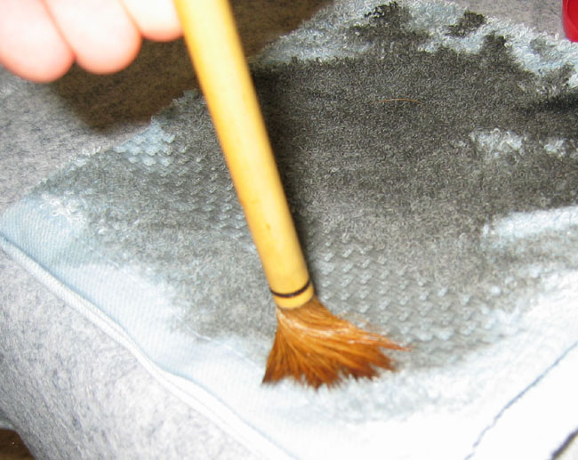
When you rinse your brush in between strokes, DON'T push the brush all the way to the bottom of the container and bend or pound the tip. There's no reason for it. It's not getting the brush any cleaner and it's bending the bristles. I found that pounding the brush also made it difficult to get a perfectly thin straight tip.
Instead, dip the brush in the water, don't touch the bottom at all, and just swirl it around in a circle. Then, *touch* it to the side of the container a few times –don't *press* it to the side of the contain. After that go directly to your dabbing cloth. Again, don't press, bend, or pound the tip into the cloth. Instead hold the brush horizontally and touch the whole side of the tip to the cloth. You can also drag it a little and help all the bristles point in the correct direction. Rotate the brush between your fingers and do it again.
When you're done, you'll notice that the brush tip is pretty dry, as well as nice and narrow with a pretty nice, if not perfect, tip.
The same goes with your pallet, no need to be rough or over flex the brush.
Make it a habit, be gentle on the brush. I'm a big dumb guy, so I find myself pounding the brush into the rinse water like an ape with a stick. I have to really make a conscious effort to be gentle, but BELIEVE IT OR NOT, I find that when I'm rough on the brush I can't paint because I'm messing up the bristles and I'm unconsciously tensing up. As soon as I make a conscious effort to be gentle on the brush, the brush works better and I can't help but relax more, and suddenly I'm painting better. That's my favorite part so far. When you're doing it right, Chinese Brush Painting is calming and relaxing.
Putting them away
Rinse the brushes gently under some water, then PAT them dry WITH a towel (don't DAB them dry ON a towel).
You can leave them on a brush rest to air dry, but ultimately you want to either store them in a roll-up or hang them with the tips pointing down. In both cases, the idea is to get the tip to stay nice and straight.
I did a search on amazon, and here are a couple roll-ups like the one I have:
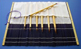 | 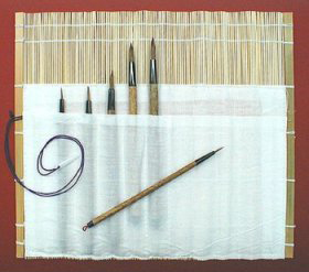 |
Note, I can't vouch for those specific brushes because I've never used them :)
Also Note: those links go to "Sumi" Brushes. Sumi (or Sumi-e) is a Japanese style of brush painting. Here's what Wikipedia has to say about it.
http://en.wikipedia.org/wiki/Sumi-e
Here's what the stands look like (sorry, couldn't find any good amazon links)
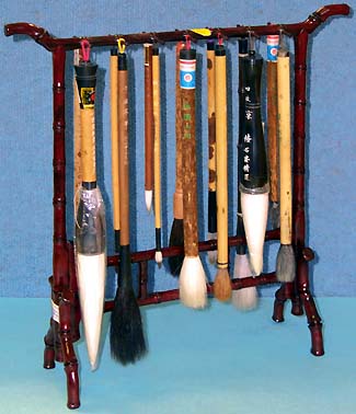
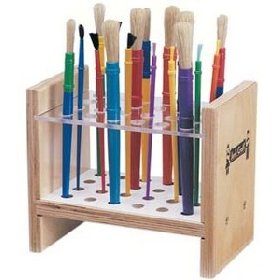
If you store all your brushes by jamming them into a can or jar, odds are you're not doing the brushes much good. If the tip is aiming upward, then gravity will effect the bristles and bend them over time. If the tip is at the bottom, then it's probably bending under the weight of the brush.
So, if you love your brushes, DON'T use anything that looks like this:
Labels:
ChineseBrush,
Materials,
Technique
Monday, January 28, 2008
Chinese Brush: Make Bamboo
Bamboo is a very common warm-up. My instructor says, if you're calm and relaxed, paint flowers; if you're stressed out, paint bamboo. And like everything, you could spend a lifetime perfecting it.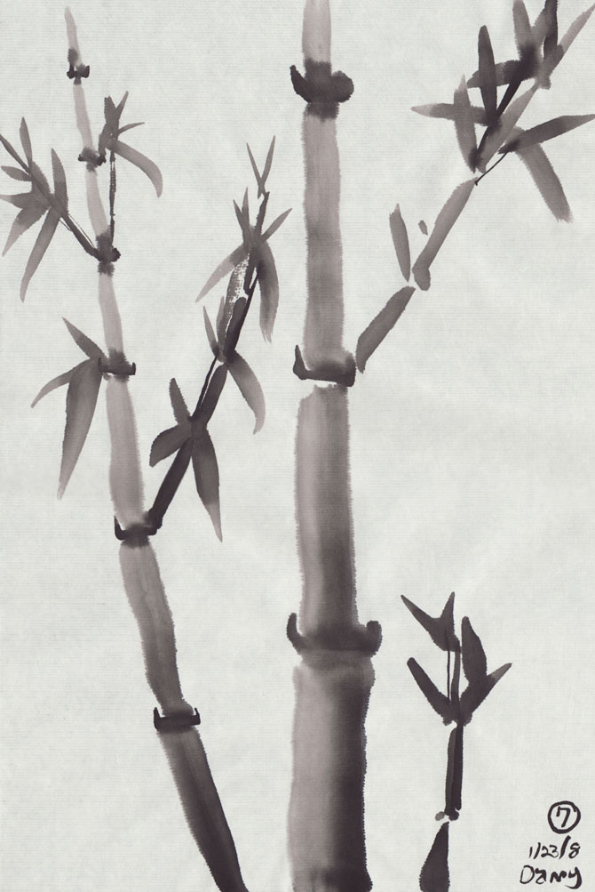
That's my best so far. It's not terrible, but it's not beautiful either. My instructor paints like poetry in motion. Every leaf is breath-taking. I'll ask if I can post the example she made in class.
Until then, here's a link to her gallery (no bamboo I'm afraid):
http://www.brushpaintingcircle.com/art/artworkone.html
Okay, moving on: I'm sharing what little I've been able to grasp, but DON'T copy me. You'd be dooming yourself to mediocrity. Instead, go find some photo reference and try to paint what you see and throw in these techniques to help get the ball rolling.
Step 1: The Trunk
--load a hard bristle brush with the three tones of gray to make a gradient.
--hold the brush at a 15 degree angle and make a stroke upward. Remember to have a start and end point so you get a bone shape.
--there is a small space between sections.
--as you make the sections of the trunk, lessen the tilt on the brush so the trunk sections get thinner.
--remember the trunk sections are straight, so if the stalk of bamboo curves at all, it's usually at the joints and it's usually very subtle.
--after making the sections of the trunk, come back with black and make a connecting line through the joints. Again it's bone shaped and the points on either end tend to flick upward.
Step 2: Branches
--branches are just like the trunk technique.
--keep in mind, branches only shoot out from the main trunk at knots between sections.
--keep in mind branches have the same basic direction as the trunk (upward). So don't make them shoot out at a 90 degree angle, make them 45 or 30 degrees upward.
--don't forget to add a line thought the knots of the branch sections (or two dabs when the branch gets thinner.
--as the branches get to be extremely thin, the last section can be a pointing stroke.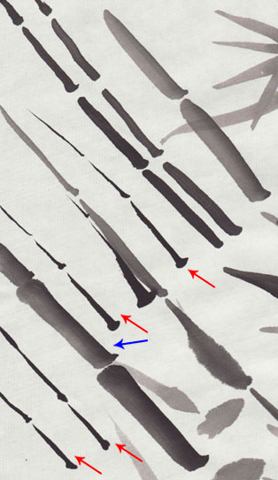
Here's some branch practice I did. Note: the pointing technique should only be used for the LAST section of a thin branch. Mine are WRONG (red arrows). See how I used pointing stroke after pointing stroke and they don't seem to hold together as one branch, verses the thicker branch (blue arrow) which have a thicker start and end point between the sections... those endpoints and the bone shape are key.
Also note, these branches don't have the line and dabs at the joints, so don't forget about those.
Step 3: Leaves
--The technique is simple, but takes much practice to master.
--we're going to be varying pressure, so you should use a *hard bristle brush* (you will find it pretty hard to do with a soft bristle brush)
--use black ink or a little dark gray + black ink.
--hold the brush at LESS THAN 90 degree angle in relation to the page. (it's tempting to do center brush, but you get better results if you tilt a little in the direction you plan on travel with your motion)
--it will be one stroke that has a nice almond shape.
--when we make the stroke, the motion is in a straight line, starting with the base and ending with the tip of the leaf.
--the pressure gives us a thicker base and then we fade away to the tip.
--remember to re-shape your brush tip before each stroke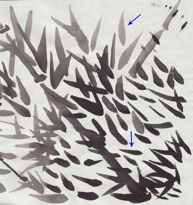
Here is just a little of the many, many leaves I did. I've made blue arrows to the only two that are even close to correct. However, as always, let's identify the mistakes.
Near the bottom middle, we see a lot of fuzzy fat leaves, my brush was too wet.
Near the bottom right, we see leaves that have mult-pronged tips. At first this might look like my brush was dry, but it turned out, I forgot to reshape the tip of my brush (so the tip was not perfect before I started, and only got worse with each leaf).
Characteristics of a Bamboo Leaf
--long and smooth. My biggest problem was that I kept making leaves that were too short, and as soon as they are too short, they also tend to look too fat.
--the leaves are usually found in bunches of three, but don't make them look like chicken feet. Vary their size, direction, length, and starting points.
--There are two types of bamboo leaves, young and old.
----Younger leaves are thinner and tend to point up (or in the direction of the branch they came from). They also appear near the end of the branch (last/thinnest sections)
----Older leaves are bigger and wider and tend to hang down. The appear close to where the branch breaks away from the trunk.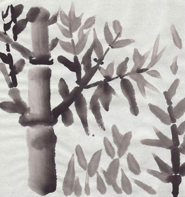
in this example, everything is just too wet. Everything blurred all over the place. On top of that, my leaves are so perfectly symmetric along the branch that they just look fake. And in some places the leaves actually shoot out at 90 degree angles, which looks even less natural.
Also, because my leaves are mostly not long enough, they appear fat and stubby.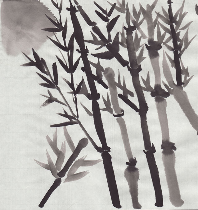
in this example, all my leaves point up (no 90 degree angles). I varied their size some, but not their direction, so they all look like young leaves, which looks out of place and wrong.
Also note: on the bottom left, again I forgot to reshape my brush tip, and my leaf tips are not a single point as a result. However, in that same spot, we can see how varying the starting point can look more interesting and less like a 3 toed chicken foot.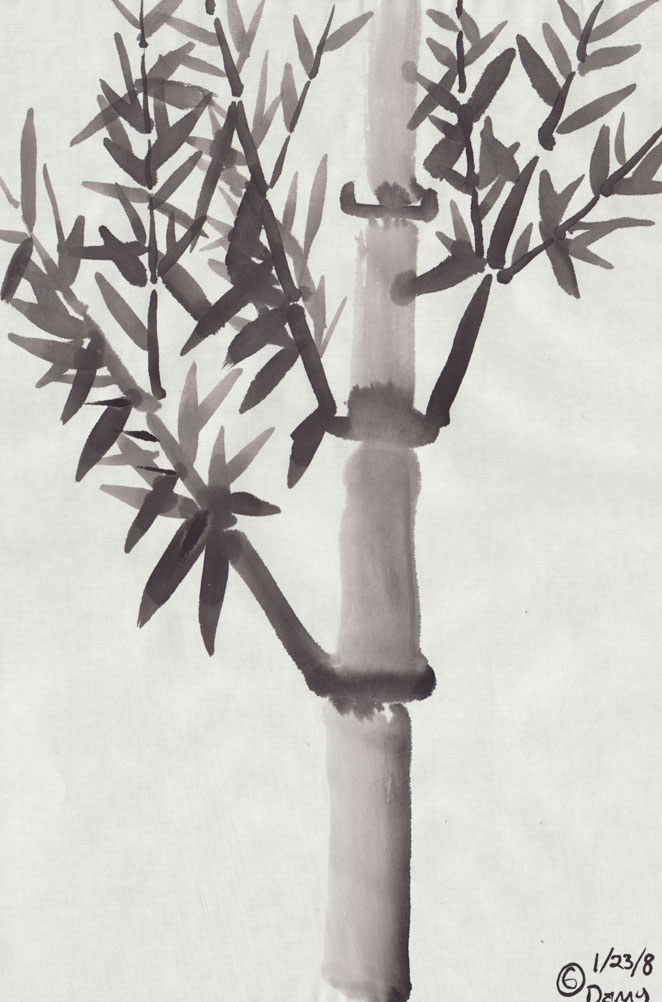
This one remind me of a fern instead of bamboo. There are just so many leaves of such a uniform size on each branch that it looks like a different type of plant.
However, there are a few older looking leaves on the bottom left branch that are not a bad variation (if only I had used them more).
Step 4: Stem Detail
--if you varied the placement of your leaves well, they should appear to be growing out of thin air in places. Use a detail brush to draw very thin lines from a knot on the branch to the base of the floating leaves to get them connected correctly. This detail add so much.
Step Zero: Composition
Composition is a whole subject unto itself, so let's not get too deep into that. Basically, we're just looking for a nice balanced final painting. And the only way to do that is to plan ahead (which is why I called it "step zero.")
Scroll up a little and look at the previous example (with the 6 in the bottom corner of the paper.) Doesn't it look out of place? It's just a bamboo trunk shooting straight up out of nowhere. Then there are lots of branches and leaves on the left side, and not so much on the right side. It feels unnatural and out of place.
A common layout is to have a bigger bamboo trunk a little off center, then a smaller one off to the side and a very small one on the other side.
I'll leave you with this last example. Again, it's not the best, but it shows progress and I'm sure you can appreciate what went into it much more now here at the end, compared to when you first saw it at the beginning of this post.
Labels:
ChineseBrush,
Technique
Chinese Brush: Make A Shrimp
In the previous post, I had a picture of two shrimp which I used as an example for various types of brush stokes. I realized it had some misleading text jotted down at the top, so I'll just explain how to make the shrimp so no one gets frustrated by trying to follow that silly text.
Here's the shrimp again:
Step 1: the body
Use a soft bristle brush. Load it up for a gradient, but make it mostly lighter gray (that bottom, bbq'ed, shrimp was a mistake :) Make a dab for the first bigger section of the body while holding the brush at 15 degrees or so.
Note that the soft bristle brush will stay bent after the stroke. Keep it bend and make the rest of the body sections using the curve of the brush to cup the curve of the last dab on the paper.
Hold the brush with less and less of an angle as you go so the body sections get smaller.
Step 2: soft brush extras.
--Add a few tail dabs at the end for a tail
--make lots of little feet (I forgot to do this on the top shrimp)
--with black ink, make some wet on wet dabs down the back of the shrimp.
Step 3: hard bristle brush extras
--use pulling strokes to make the area in front of the mouth and the arms. (remember bone shaped strokes)
--use a detail brush and pointing strokes to make the whiskers
--don't forget dabs for the eyes (I forgot this for the top shrimp as well)
Labels:
ChineseBrush,
Technique
Chinese Brush: Types Of Strokes
I'm sure every instructor has their own names for these things, but here are the basic stroke techniques as I was shown them.
First off, here's a couple of examples of the techniques in the form of shrimp (or crayfish or whatever).
(note, the top one doesn't have legs because he's a super shrimp. Don't mess with the super shimp 'cause he can fly –er swim...)
The approach
--This is not a type of layered painting like oil on canvas. You will find yourself starting with the foreground and filling in the background later.
--most strokes are final. We try to get it right the first time since layering instantly becomes "wet on wet" techniques, which is a whole different animal.
How to hold and move the brush:
--We hold our arm straight out with our thumb pointing 45 degrees up ward. The brush will point straight down. We are mostly gripping between the thumb and first two fingers with the ring finger and pinky lightly touching for control.
--do not squeeze. It's a gentle, loose touch. One method of practice for getting the shape of your hand and the lightness of the grip is to hold the brush while also holding an egg in your palm. The egg should not drop or get crushed. (note, holding the brush too tightly will result in aching hands. Continuing to do so for years will result in pain.)
--from here we may tilt our arm/wrist in various ways to change the angle in which the brush's tip touches the paper.
--Chinese *Calligraphy* uses a lot of wrist movement. Chinese *Painting* uses your arm. We make nice long, smooth, strokes by moving from the shoulder, not from the wrist. However when making finer isolated details, we may use the wrist more.
--we hold the brush three quarters of the way up when drawing thick lines and three quarters of the way down for thin lines. (or basically "near" the top or "near" the bottom, not "at" the top or bottom.)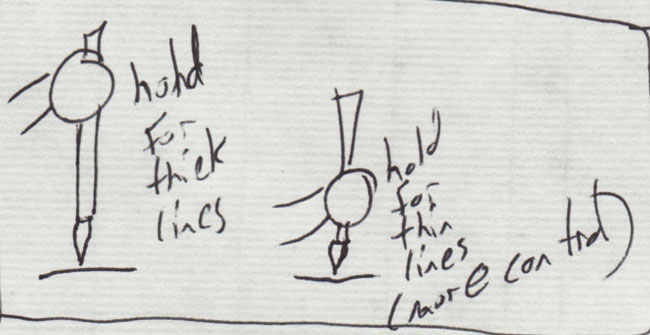
Brush angles and center brush
There are two ways to make thick and thin lines. With pressure, or by tilting the brush. When we hold the brush directly vertical (90 degrees in relation to the page), this is call "Center Brush." It will give us the thinnest lines (provided we can control our pressure).
From there we can tilt the brush and start getting thicker lines. Try 60 degrees, 40 degrees, 30 degrees and 15 degrees. (remember, when we made that nice wide gradient? The brush was at 15 degrees.)
Specifically with Center brush, we try to keep the very tip of the brush in the center of the line. But when we start tilting the brush for thicker lines, we keep the tip on one side of the line and move the brush to the side.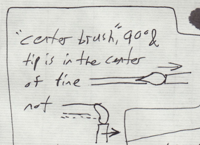
Center brush is good for changing directions because the tip of the brush will trail along behind you and point in the direction of the line you're leaving behind. However, it's much harder to change directions when you're tilting the brush at an angle.
For example, the shrimps whiskers were made with center brush, while the sections of the body were made by tilting the brush less and less with each dab.
strokes vs marks
Most strokes have a definite start and end point, this gives the stroke a bone shape (like the shrimp's arms). A mark is just a mark on the page. It has no start or end and will often feel more random and unintentional. Most times, a stroke with one or two endpoints will look better than a mark.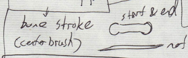
Don't fight the endpoints, embrace them. Realize that in nature things sprint from other places. Grass has a wider start point at the base, so do tree branches. Even a knot on a tree will not be perfectly round, it will have a direction it was drown from (so it looks like a dab of a brush, not a dot)
pulling stroke
a pulling stroke is a thin line with a start and end point that may change direction. So it has that bone shape and it's done in center brush.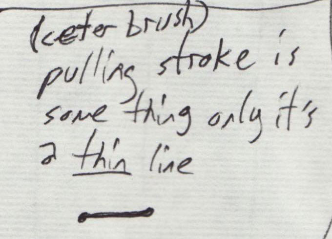
pointing stroke
a pointing stoke is a thin line with a start point but no end point. They are made using a hard bristle brush in center brush position.
The shrimp's whiskers are pointing strokes.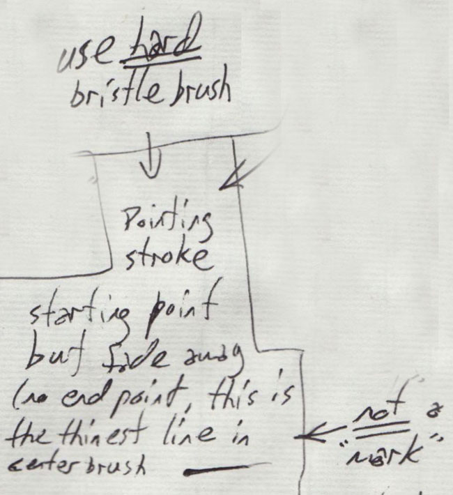
Reshaping your brush tip
Before making a stroke, look at the very tip of your brush. Is it perfectly pointy and straight? If not, fix it before making the stroke. Do this by touching it to an empty chamber in your pallet and rolling a little. Don't use the dabbing cloth because that will pull ink out of the brush. Strokes will always look better if the tip is reshaped before you use it, so get in the habit.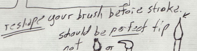
Finally, here are those crayfish/shrimp again so you can get another look at how the strokes come together.
Labels:
ChineseBrush,
Technique
Friday, January 25, 2008
Chinese Brush: Wet On Wet
Since the brush can be wet or dry and the page can be wet or dry, we have a few obvious combinations that result from this.
Wet brush on dry page.
Wet brush on wet page.
Dry brush on dry page.
Dry brush on wet page.
Wet On Wet
It's worth experimenting with all of them, but here are some wet on wet examples.
Here I made a dab that soak into the paper, then I ran a smoother black line into it (downward). So you can see how the line starts to spread as soon as it touches the wet page.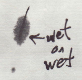
in the next one, I again had some wet ink on the page, and this time made a dot or dab into it. When completely contained in the wet area, it makes a nice starburst dot. But when done on the edge of the wet area, it will flow right passed the boundaries of the original stroke.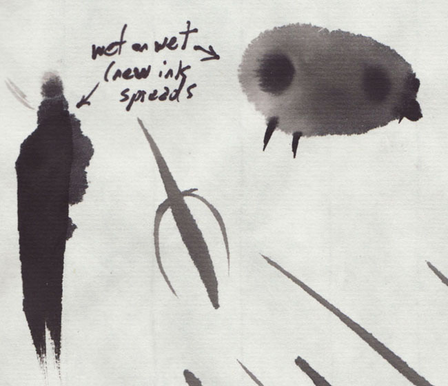
but even though the new wet ink will flow passed the boundaries of the stroke before it, it tends to flow to the wet area first. In this next example, I made an "S" with JUST WATER, then touched an ink brush to either end to see how the ink flows down the path that's already been laid out for it.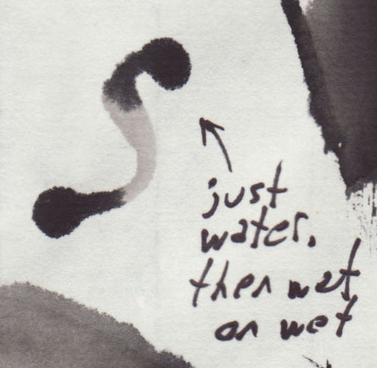
Speed Kills Spreading!
This is really useful. If you have a wet brush and you make your strokes faster, then the paper doesn't have enough time to absorb the ink –therefore it does NOT spread.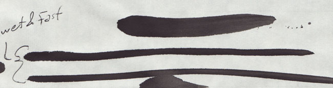
Vary of Speed
So naturally, if you vary the speed of the stroke, you'll vary the amount of ink the paper can absorb and thus vary the thickness of the line. This example was made with a CONSTANT pressure. I know it's obvious that changing pressure on the brush will give you a thicker line, but this was NOT the case (that's why it's so interesting).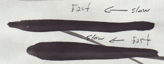
so again, above is constant pressure, varying speed.
Fast with Vary of pressure
And so you can see the difference, below is varying pressure, but constant fast speed.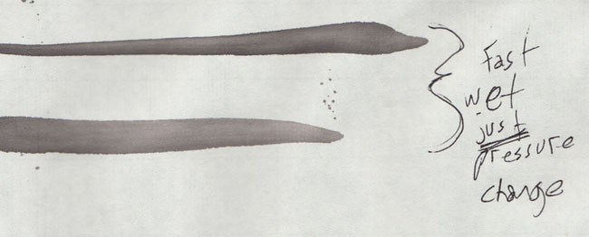
note how this one has crisp edges the whole way through, while the previous method gives us a fuzzy edge in the wider part of the line.
I'm sure each has it's uses. I used the change in speed to make this feather/quill
I'm guessing I should have gone a little slower at the bottom to let it get even fuzzier, but you get the idea.
Wet on dry
I don't have a picture to go with this, but if you make a stroke and then let it dry before making another stroke on top of it, the second stroke should effect the first as if it were effecting the dry page. So a fast stroke on a dry stroke should not bleed, while a slow stroke on a dry stroke should start to spread like normal.
--but I'll have to double check this last one the next time I have the inks out.
Labels:
ChineseBrush,
Technique
Chinese Brush: Basics
Here are notes from a Chinese brush class I'm taking. I'm a total beginner, so I'm going to start with little details I gathered when first touching brush to page.
First thing's first.
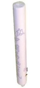
We had 3 types of brushes:
--a hard bristle brush (medium sized)
--a soft bristle brush (medium sized)
--a hard bristle detail brush (small)
All of the brushes are round, none have that flattened or pinched look that you see in a lot of arts & crafts sections of a store.
Like This: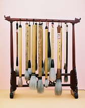 | NOT this: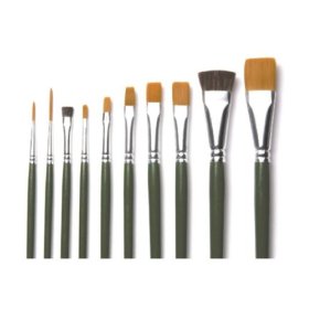 |
Identifying the difference between a hard bristle brush and a soft bristle brush:
hard bristle is more springy and will return to being straight and pointy after/during the brush stroke. Soft bristle will bend as you touch it to the paper and stay bent after you lift it up.
If you're making strokes that involve changes in pressure (bamboo leaves, etc) you'll want to use the hard bristle brush because it will continue to contact the page as you lighten the pressure.
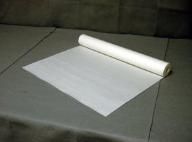
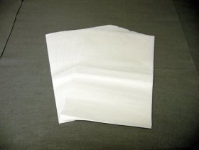
Paper:
There are a million types of paper, but lets just talk about two major categories, for ease of writing, I'll call them treated and non-treated.
Non-treated paper is just paper, it will absorb the ink and the ink will spread.
Treated paper has a special coating on it to keep the ink from absorbing... it's like beads of water on a waxed car. You can literally blow beads of ink around on the paper.
We're starting with the cheaper, non-treated paper.
Paint on the softer side of the paper.
Here are some examples I found on amazon:
 |  |
 |
So the first thing you notice is that you touch the page and the ink just spreads...
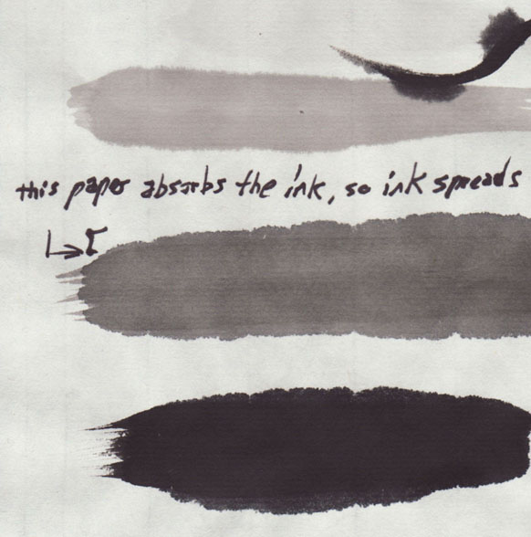
at first this seems like a disaster, but it's good for making fuzzy stuff, like these doodles.
ink and greys
there's some history behind inks and how they use ink sticks and grinding stones like these:
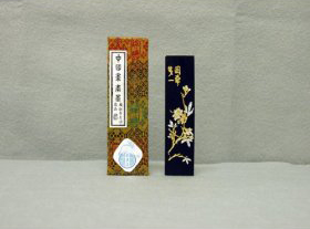 | 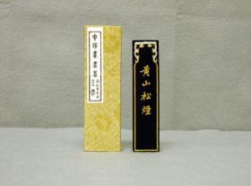 |
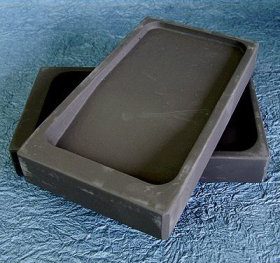 | 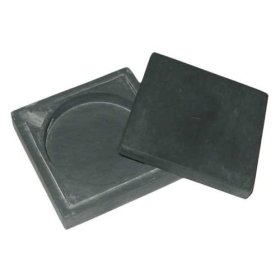 |
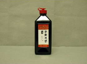
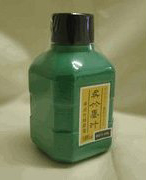
HOWEVER we're using black ink from a bottle, so I'll only talk about what I've used.
These aren't the exact inks we use, but you get the idea:
 |  |
The ink is black and the only way to get gray is to dilute it with water. Our instructor uses a simple technique of having 3 containers for holding the "palette" (for lack of a better word). These containers are about the size of those single service puddings or yogurts (in fact, that's what we use at home). This is what the one from class looks like:
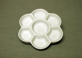
The first container (or well or what-not) just has some black ink in it (don't fill it up! in the image above, You'd still be able to see the white bottom of one of those side chambers), the other two chambers are about half full of water. We then dip the brush into the ink, then go directly into the 2nd container and swish it around in the water 5 or 6 times, then we go directly to the 3rd container and swish it around in the water once or twice and then clean the brush.
Now we have 1 black, 1 dark gray, and 1 light gray.
So the first step in any session is to mix and test your grays.
Use more ink or more water to adjust the grays to the darkness or lightness you're looking for (depending on what your painting, etc)
Gradients
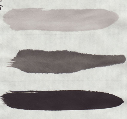
The point of these grays is to load up the brush with all three tones and make gradients.
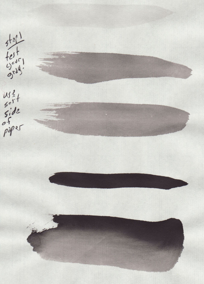
Note: that's light gray, 2 strokes of dark gray, then black, followed by a poor quality gradient. So DON'T try to make gradients that look like the one above.
The gradient will vary based on the tones of your grays to start with, and then how well you load them into the brush. The first is easy, the second is hard.
When the brush is loaded correctly, you get a nice smooth gradient from light gray to black. But when it's not loaded correctly, you get more of a banding/rainbow-ish effect.
note: I'm left handed and all stroke started at the bottom and moved toward the top.
on the left we have an "okay" gradient, but not a great gradient. The transition from the black to the dark gray is nice and smooth, but the transition from dark gray to light gray is pretty abrupt.
In the middle, we have an all around bad gradient. It's mostly light gray and black, and the dark gray is almost non-existent, so there's a really abrupt transition from light to dark.
On the right we have another bad example. It's mostly light gray, with a touch of dark gray and it's too dry and breaks near the top.
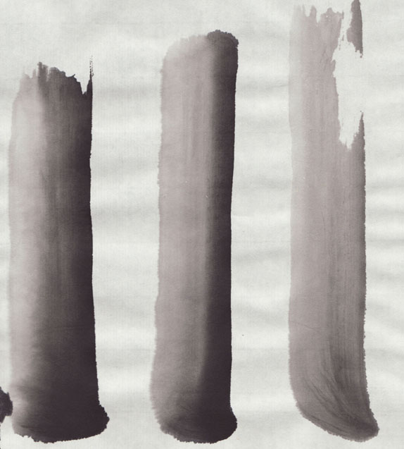
The gradient technique (loading the brush)
Now that you know what it can look like, here's how to do it.
--Clean out the brush and dab it mostly dry.
--dip the brush completely in the light gray.
--dab lightly on dabbing cloth.
--dip the brush half way into the dark gray.
--dab lightly (or dab tip) on dabbing cloth.
--touch the tip of the brush to the black ink.
You'll notice right away that the final gradient will reflect how much you put on the brush, so if you did way more light gray than dark gray, you'll get something like that middle example above, while that example on the right has hardly any black on the brush at all.
The gradient technique (using the loaded brush)
When you make the stroke, you hold your brush at a 15 or 30 degree angle compared to the page, touch down and pull upward so the brush makes the widest mark possible.
NOTE: I'm left handed, so my black is on the right side. Odds are you're right handed, so your gradients will be darker on the left side.
Honestly, it's a lot of practice just to get your grays the correct tone and then to actually get the brush loaded correctly and make that once nice smooth gradient. Then when you finally get it, you'll realizes the brush is only good for one stroke and needs to be loaded again, which means there's no guarantee the next gradient will be good.
Dabbing is key
I didn't learn this my first day, so I'm making note of it specifically. Since the grays are mostly water, you need to dab them on a dabbing cloth before you make the stroke on the page.
Because the gradients involved putting the whole brush into the light gray, I just assumed the brush was supposed to be really wet all the time. I was wrong. Like everything, it depends on what you intend on doing. In the end, I found I got the best results when the brush was NOT very wet.
How wet is to wet? gray example:
Overly Wet brush: ink really spreads and you can probably make 3 or 4 soppy strokes before it starts to be useful, then you'll get maybe 2 nice strokes.
Not so wet brush: you'll get 1 or 2 nice strokes from it, then you should have to clean, and reload with ink.
Dry brush: will not make smooth strokes. Will break a little in the line it leaves behind. Can be very cool for adding texture.
Also realize those examples you just read are with the grays, which are mostly water. The straight black ink acts differently. It's much silkier and easier to put on the page without it spreading all over the place.
Overall
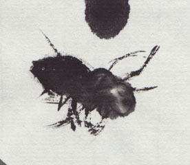
Embrace it. It seemed scary to me that the ink just spreads all over the place. I thought: how can anyone ever do what they indent on doing!? But eventually you realize the best gradients are the ones where you give the ink and paper enough water to spread together.
The instructor has a very calm, centered demeanor, and tells us that you are only doing half the work, you are only making half of the creation. The ink and the paper will react however they want to. Don't fight it, embrace it. See what the paper wants to make rather than trying to force it to do what you want it to do.
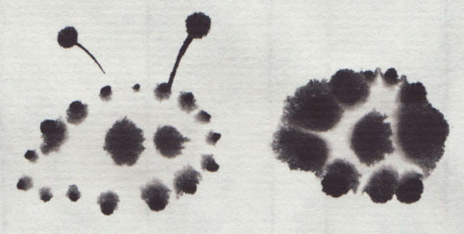
I'm sure that's something she says to beginners, but in all honesty, once I stopped fighting it, I really enjoyed it. There's something Zen and calming about letting the ink and paper have half the creative control. Before long we were just making fuzzy creatures and laughing at how unintentionally cute they were.
also, this bee was a complete accident... I tried to reproduce it but just made a mess. Still, I rather enjoyed the making of this bee the most, while the others felt like I was trying too hard.
Labels:
ChineseBrush,
Materials,
Technique