


Here are notes from a Chinese brush class I'm taking. I'm a total beginner, so I'm going to start with little details I gathered when first touching brush to page.
First thing's first.
We had 3 types of brushes:
--a hard bristle brush (medium sized)
--a soft bristle brush (medium sized)
--a hard bristle detail brush (small)
All of the brushes are round, none have that flattened or pinched look that you see in a lot of arts & crafts sections of a store.
Like This: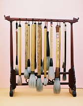 | NOT this: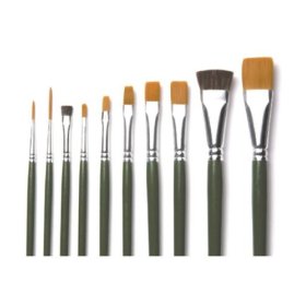 |
Identifying the difference between a hard bristle brush and a soft bristle brush:
hard bristle is more springy and will return to being straight and pointy after/during the brush stroke. Soft bristle will bend as you touch it to the paper and stay bent after you lift it up.
If you're making strokes that involve changes in pressure (bamboo leaves, etc) you'll want to use the hard bristle brush because it will continue to contact the page as you lighten the pressure.
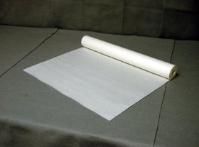
Paper:
There are a million types of paper, but lets just talk about two major categories, for ease of writing, I'll call them treated and non-treated.
Non-treated paper is just paper, it will absorb the ink and the ink will spread.
Treated paper has a special coating on it to keep the ink from absorbing... it's like beads of water on a waxed car. You can literally blow beads of ink around on the paper.
We're starting with the cheaper, non-treated paper.
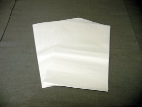
Paint on the softer side of the paper.
Here are some examples I found on amazon:
 |  |
 |
So the first thing you notice is that you touch the page and the ink just spreads...
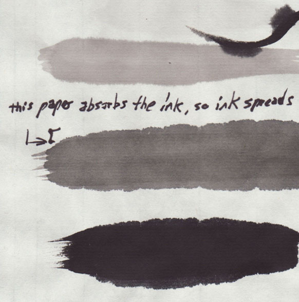
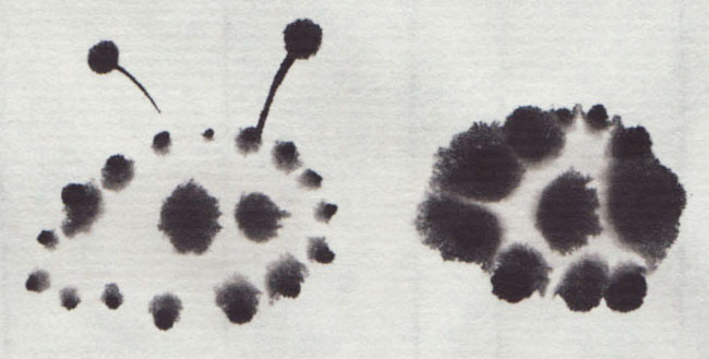
at first this seems like a disaster, but it's good for making fuzzy stuff, like these doodles.
ink and greys
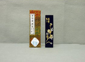
there's some history behind inks and how they use ink sticks and grinding stones like these:
 | 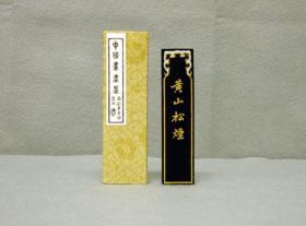 |
 |  |
HOWEVER we're using black ink from a bottle, so I'll only talk about what I've used.
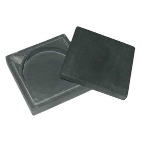
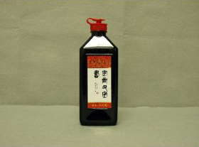
These aren't the exact inks we use, but you get the idea:
 | 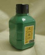 |
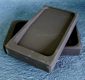
The ink is black and the only way to get gray is to dilute it with water. Our instructor uses a simple technique of having 3 containers for holding the "palette" (for lack of a better word). These containers are about the size of those single service puddings or yogurts (in fact, that's what we use at home). This is what the one from class looks like:
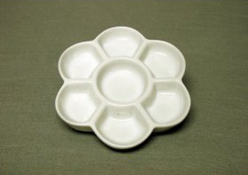
The first container (or well or what-not) just has some black ink in it (don't fill it up! in the image above, You'd still be able to see the white bottom of one of those side chambers), the other two chambers are about half full of water. We then dip the brush into the ink, then go directly into the 2nd container and swish it around in the water 5 or 6 times, then we go directly to the 3rd container and swish it around in the water once or twice and then clean the brush.
Now we have 1 black, 1 dark gray, and 1 light gray.
So the first step in any session is to mix and test your grays.
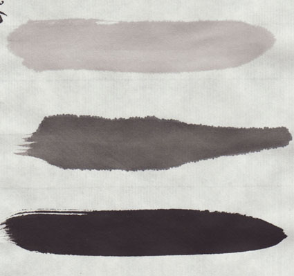
Use more ink or more water to adjust the grays to the darkness or lightness you're looking for (depending on what your painting, etc)
Gradients
The point of these grays is to load up the brush with all three tones and make gradients.
Note: that's light gray, 2 strokes of dark gray, then black, followed by a poor quality gradient. So DON'T try to make gradients that look like the one above.
The gradient will vary based on the tones of your grays to start with, and then how well you load them into the brush. The first is easy, the second is hard.
When the brush is loaded correctly, you get a nice smooth gradient from light gray to black. But when it's not loaded correctly, you get more of a banding/rainbow-ish effect.
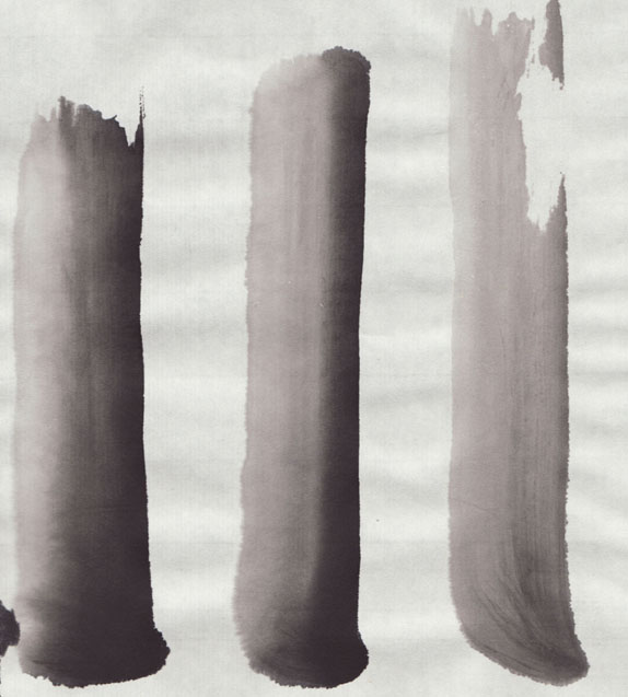
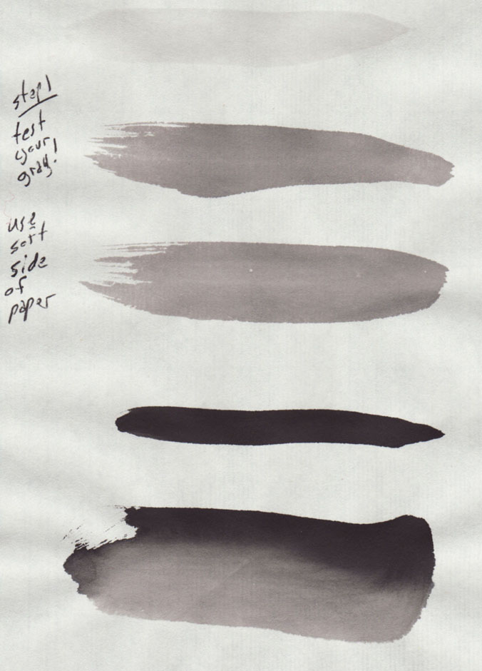
note: I'm left handed and all stroke started at the bottom and moved toward the top.
on the left we have an "okay" gradient, but not a great gradient. The transition from the black to the dark gray is nice and smooth, but the transition from dark gray to light gray is pretty abrupt.
In the middle, we have an all around bad gradient. It's mostly light gray and black, and the dark gray is almost non-existent, so there's a really abrupt transition from light to dark.
On the right we have another bad example. It's mostly light gray, with a touch of dark gray and it's too dry and breaks near the top.
The gradient technique (loading the brush)
Now that you know what it can look like, here's how to do it.
--Clean out the brush and dab it mostly dry.
--dip the brush completely in the light gray.
--dab lightly on dabbing cloth.
--dip the brush half way into the dark gray.
--dab lightly (or dab tip) on dabbing cloth.
--touch the tip of the brush to the black ink.
You'll notice right away that the final gradient will reflect how much you put on the brush, so if you did way more light gray than dark gray, you'll get something like that middle example above, while that example on the right has hardly any black on the brush at all.
The gradient technique (using the loaded brush)
When you make the stroke, you hold your brush at a 15 or 30 degree angle compared to the page, touch down and pull upward so the brush makes the widest mark possible.
NOTE: I'm left handed, so my black is on the right side. Odds are you're right handed, so your gradients will be darker on the left side.
Honestly, it's a lot of practice just to get your grays the correct tone and then to actually get the brush loaded correctly and make that once nice smooth gradient. Then when you finally get it, you'll realizes the brush is only good for one stroke and needs to be loaded again, which means there's no guarantee the next gradient will be good.
Dabbing is key
I didn't learn this my first day, so I'm making note of it specifically. Since the grays are mostly water, you need to dab them on a dabbing cloth before you make the stroke on the page.
Because the gradients involved putting the whole brush into the light gray, I just assumed the brush was supposed to be really wet all the time. I was wrong. Like everything, it depends on what you intend on doing. In the end, I found I got the best results when the brush was NOT very wet.
How wet is to wet? gray example:
Overly Wet brush: ink really spreads and you can probably make 3 or 4 soppy strokes before it starts to be useful, then you'll get maybe 2 nice strokes.
Not so wet brush: you'll get 1 or 2 nice strokes from it, then you should have to clean, and reload with ink.
Dry brush: will not make smooth strokes. Will break a little in the line it leaves behind. Can be very cool for adding texture.
Also realize those examples you just read are with the grays, which are mostly water. The straight black ink acts differently. It's much silkier and easier to put on the page without it spreading all over the place.
Overall
Embrace it. It seemed scary to me that the ink just spreads all over the place. I thought: how can anyone ever do what they indent on doing!? But eventually you realize the best gradients are the ones where you give the ink and paper enough water to spread together.
The instructor has a very calm, centered demeanor, and tells us that you are only doing half the work, you are only making half of the creation. The ink and the paper will react however they want to. Don't fight it, embrace it. See what the paper wants to make rather than trying to force it to do what you want it to do.
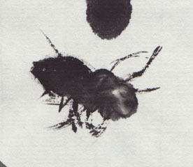
I'm sure that's something she says to beginners, but in all honesty, once I stopped fighting it, I really enjoyed it. There's something Zen and calming about letting the ink and paper have half the creative control. Before long we were just making fuzzy creatures and laughing at how unintentionally cute they were.
also, this bee was a complete accident... I tried to reproduce it but just made a mess. Still, I rather enjoyed the making of this bee the most, while the others felt like I was trying too hard.


No comments:
Post a Comment